May
26
2014
Interactions #3


They really aren’t kidding with this film when they say handle in subdued light. I thought that for the most part I had been careful yet the film ended up being heavily light struck. All indications are that the light came in through where the film exits the canister so none of this would have been while the film was in the camera. What makes this film unique is that it doesn’t have the usual orange dye masking of nearly all other c41 colour negative films. This is supposed to make it easy to scan and more versatile in different lighting. Unfortunately for me the light leak over rides any other factor of this film. That being said even those images struck by light have a certain look that makes them unique and clearly sets them apart as being from film.

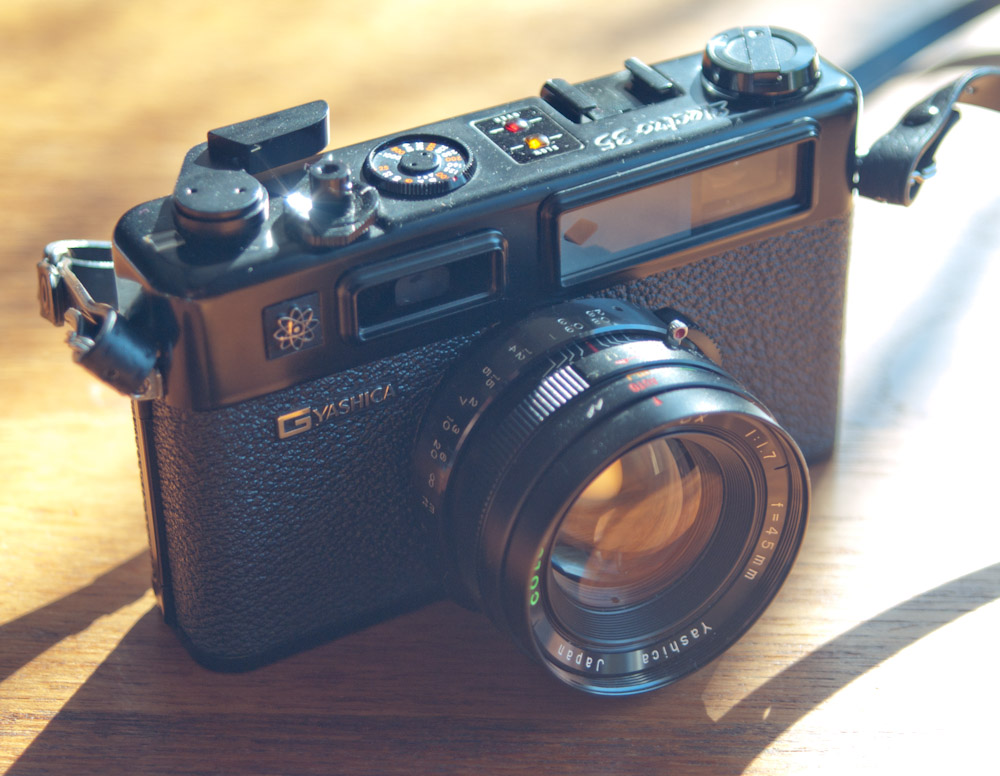
I shot this roll of film in my trusty Yashica Electro GT


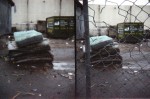
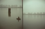
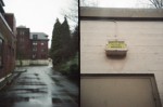
The Holga TIM is an interesting camera that lends itself to photographic experimentation. With its two lenses that can be covered and uncovered independently and the fact that the shutter can be reset without advancing the film it allows you to shoot two images side by side within the space of a regular 35mm film frame. You can also do multiple exposures on a single frame using the shutter reset. For these images though I would expose one lens at a time and then reset the shutter and exchange which lens was uncovered, producing diptychs on film.


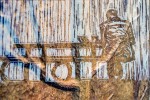
It’s all been seen before as the saying goes. I want to back up for a minute though. In 2013 I was driving south on the Trans Canada Hwy through the Thompson Canyon. I am always looking for things to photograph but in this case my desire to pull over was additionally fueled only in the way that too much coffee and hours of driving can. At a certain point I saw a foot bridge over the river that I had never noticed before and doubled back to see if I could have a closer look. I made my way down to the footings of the bridge which was completed locked against any entry but I knew I had to photograph it. I took a few pictures and was quite pleased but what I really wanted was a train with tanker cars across the river. I didn’t need to wait long. I took a few shots to get things set up and waited for the right moment when the tankers were in the frame. I included the river in the composition as I was trying to show in one image the precarious situation of oil filled rail cars on the edge of one of the most important rivers in British Columbia.
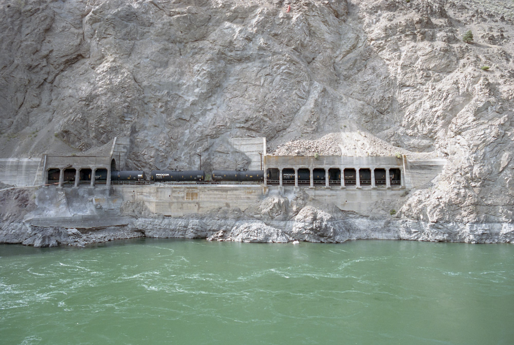
Thompson River with tanker cars, 2013 (Wallace Koopmans)
Fast forward to May 2014 when I went to the Vancouver Art Gallery. I reached the second floor with the Edward Burtynsky exhibit and I was only three images in when I was confronted with the large-scale print (Railcuts #11 CN Track Thompson River, British Columbia 1985)

I knew immediately that this was the same location that I had been at the previous summer. Now I was aware of Burtynsky’s series ‘Railcuts’ and had seen several examples but I don’t believe I had ever seen this image. That doesn’t really matter though because I am clearly influenced by his work. Looking at the printed image the amount of detail he captured was amazing far beyond what I recorded with my piddly 35mm camera.
I enjoyed the rest of the exhibit and noticed several things about his work. In his more resent images he has a greater degree of abstraction with less of a sense of depth and an often higher vantage point. The difference this makes is that with some works if you stand at a certain distance they give a feeling of looking through a window right into the scene, that effect doesn’t happen with the aerial shots. If you are unfamiliar with Edward Burtynskys work I encourage you to take any opportunity to see one of his prints that you can, failing that check out one of his books, an image on a screen will not do them justice.

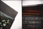
I shot an entire roll of film through my Olympus OM1…twice. It was on purpose of course and I took quite a bit of care in lining the film up for the second go around. I achieved this by making a small scratch on the film so that I could align it the same both times. This actually was harder than it sounds as each time you start loading the film it’s like some sort of random position generator. The first exposures were all of various line art from old technical books and some of my own block prints. What I discovered was that such small areas of high contrast like this were not ideal for double exposures. Many of the line art images are lost in the other second images. However that is how you learn and improve. I added a further layer of complexity to my endeavor by making a list of all the images and then trying to make some sort of match between the two. Here are some of the better examples from this test, in the future I think I would make sure that I used larger areas of dark and light so it makes more of a cut out effect of the second image. The other thing is that despite the visual contrast of black on the white of paper this isn’t nearly enough contrast. Not like what you get from a light source and a silhouette.


In the image above the lenses on the right side are all homebrew lenses I made for the Pentax Q. I purchased three Q mount to C mount adapters, took them apart and used only the part that mounts to the camera. The lenses themselves are a 12mm pancake distortion creator a 35mm f2.8 and the newest one a 40mm f1.9 from a Canon AF35ML which is currently set to a fixed focus point and aperture and works like a macro lens. They are of course manual focus and with the conversion factor the 40mm has a field of view similar to a 220mm lens on a ‘full frame’ sensor or 35mm film. Each one of these lenses has limitations in the quality of the image they produce but are a fun way of experimenting.


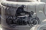
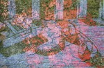
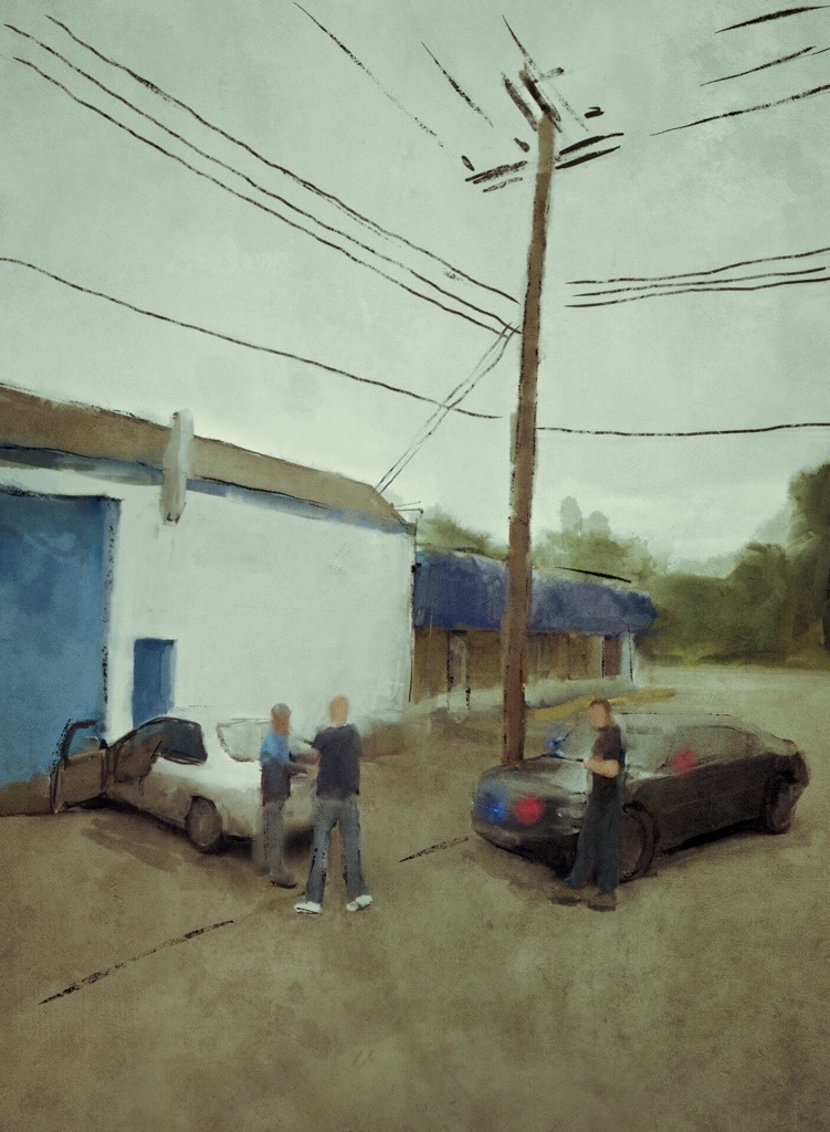
This is the start of a series of digital paintings based on Google street views.
The way we interact helps to define us as humans. These interactions can be fleeting and no more so than those captured by chance. I wanted to separate the final images from being simple screen captures and so have recreated them as digital paintings on my iPad. I hope with this context the images will speak for themselves.

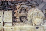
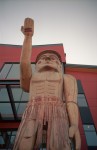
Here are some more images from the fantastic little Ricoh R1 camera using 100 ISO Kodak Ektar. A follow up to Ricoh R1


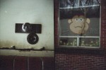
 (Yes the picture of the camera is grainy it earned it)
I had high hopes for this camera as it is a compact and is touted to have an excellent 6 element lens. Those things may be true but unfortunately for me my first roll was under exposed. I’m not entirely sure if it was a problem with the batteries or the camera but in any case it was consistently under exposing. Which tends to give you images that look like this viewed at 100%. (Fuji Superia 400)

Despite the exposure issue it is an attractive camera with an interesting design. It has some similarities with the Olympus XA notably that they both have a sliding lens cover and 35mm f2.8 lenses. They are of very similar size with the Minolta being slightly taller and they both use a thumb wheel to advance the film and set the shutter. They differ though in that the Minolta AF-C is autofocus and auto exposure while the Olympus XA is a rangefinder and aperture priority. Had it not been for the exposure issues I had I’m sure that I would be saying that the Minolta was the better camera to use as the rangefinder on the XA is very small and fiddly.


