Jan
11
2012
Not every image can and should be composed by “rules” but awareness of the underlying reasons can aid in understanding how to use them to create images that say what you intended. When composing within a square format things are slightly different than the more familiar rectangle. The image edge is even more important and in reality is part of the overall picture. What I mean by this is that the placement of the focal point is more strongly felt in a square image than a rectangle as the distance between the focal point and any one edge is easily visualized. So the balance of an image within the frame is more quickly discernible by the viewer even if only subconsciously.

Looking at figure A it is clear that the circle, which for this illustration represents our focal point, is in a dynamic position with greater tension between the left and top edge verses the bottom and right edge.
Figure B is also unbalanced but to a lesser degree as the tension is primarily between the left and right edge of the frame.
In the final illustration Figure C you can see that the image is balanced and the competing tensions are neutralized.
When composing for rectangles we often try to avoid placing the focal point at the center of the image. With rectangles there never is truly complete balance as there is always a difference between the distances from top to bottom or left to right. The result of this is usually a very static and boring image.
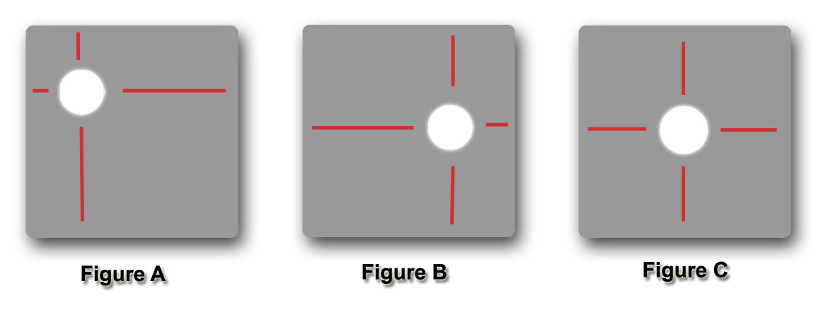
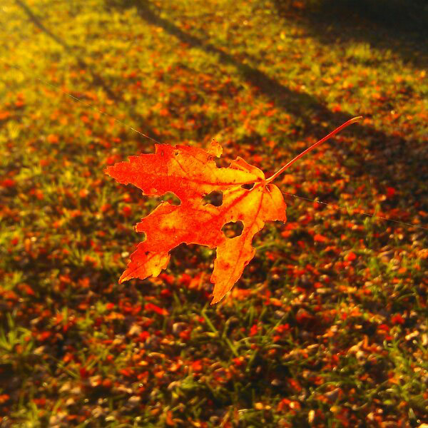
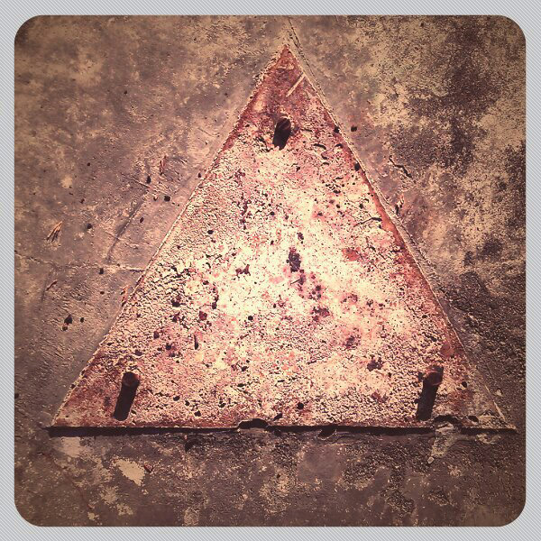
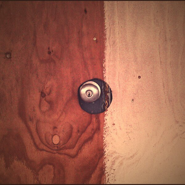
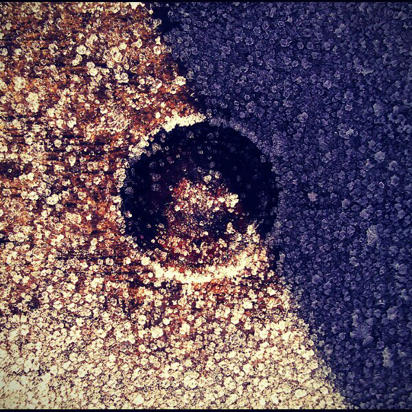
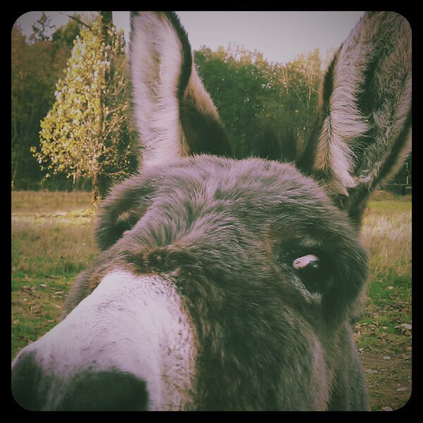
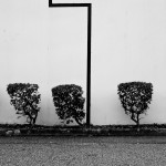
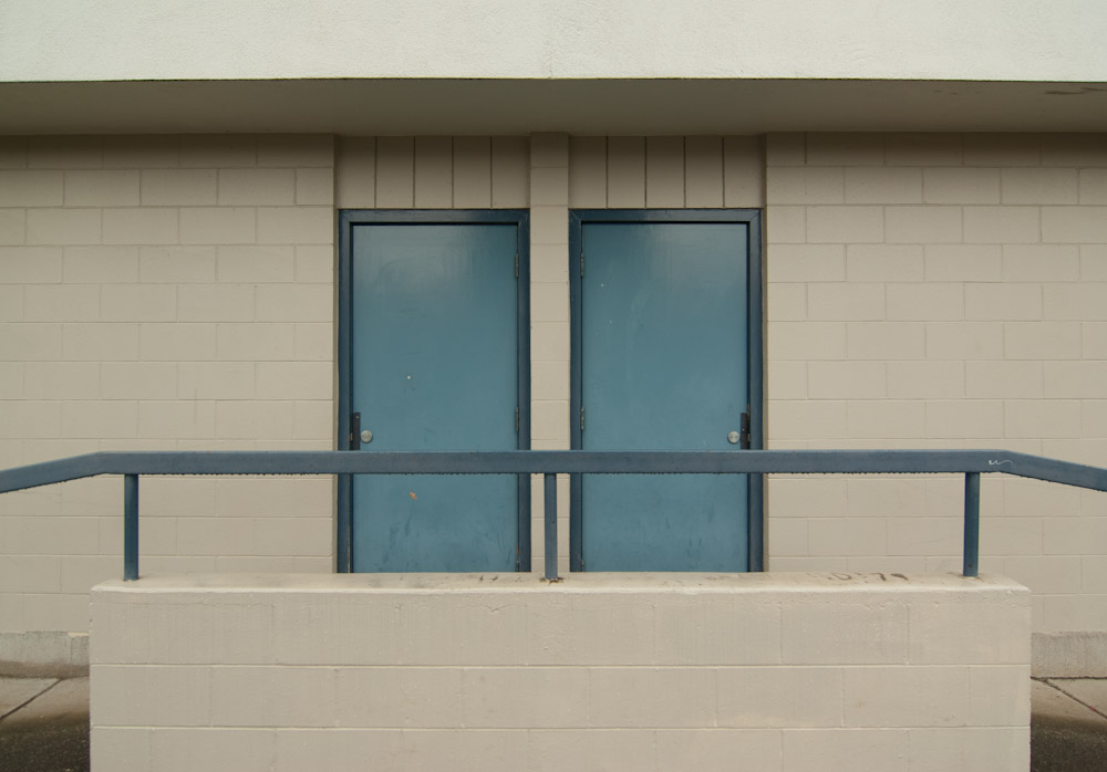
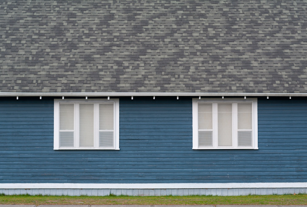
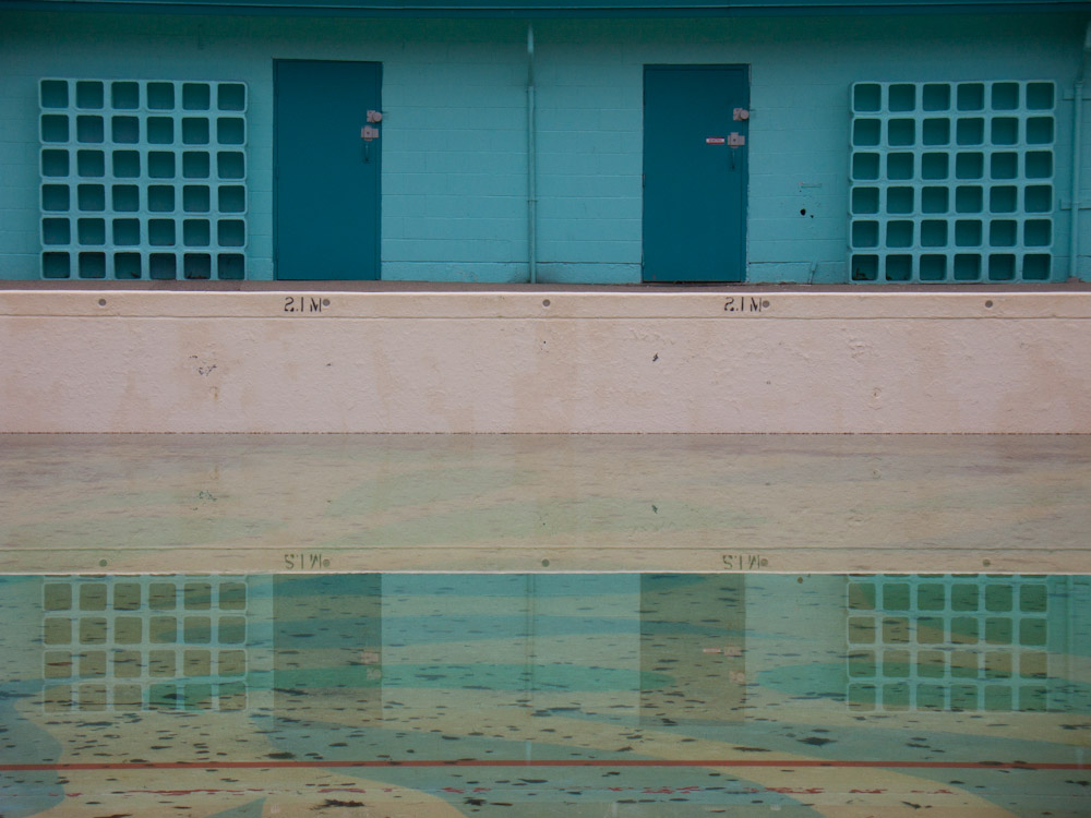
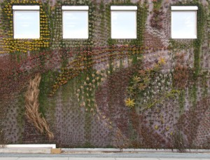
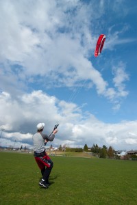
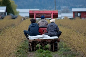
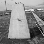
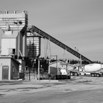
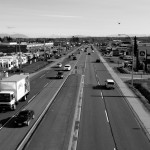
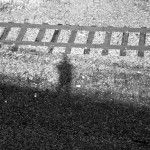
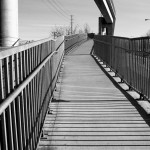
Here are four examples of images shot with my cell phone that illustrate the point of balance between the subject and the frame.


You can also see that in the latter two images I have divided the image plane separately from the focal point adding to the interest of the images while keeping the focal point balanced.
More often than not this will still not produce the most dynamic composition but thinking about the picture edge and it’s effect on the image will help you create better compositions.
Don’t be afraid to break out of the box

2 comments | tags: composition, Square | posted in Composition, Photography
Jan
10
2012
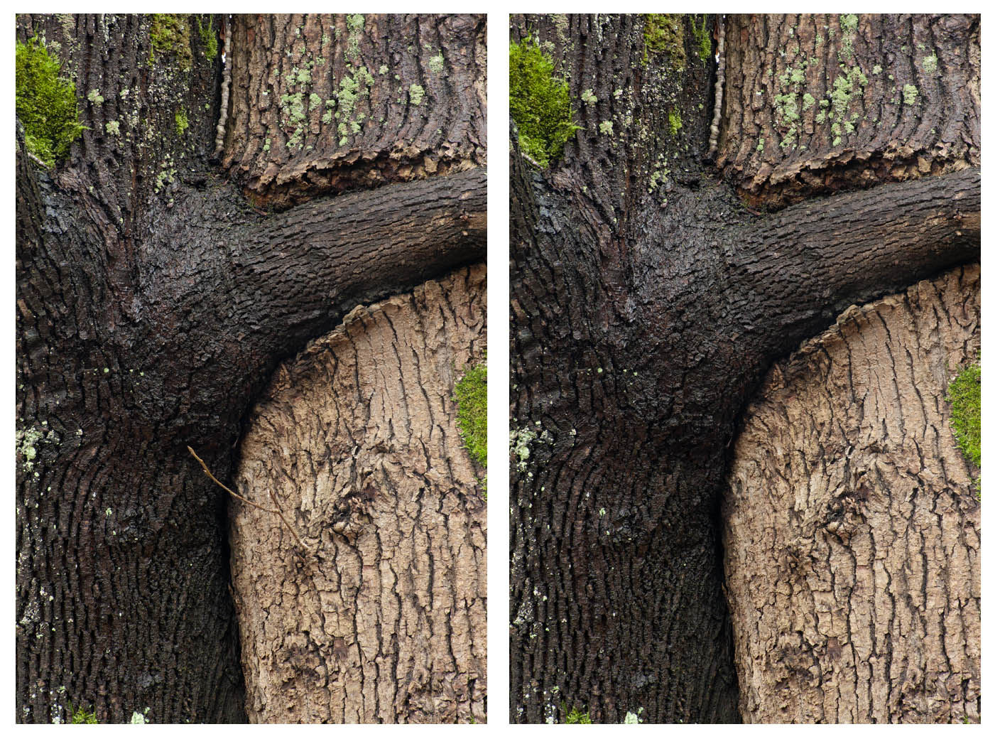
I wanted to show a simple example of how powerful a point of high contrast can be in a composition. Despite the small size of the light coloured branch it’s contrast against the darker tree pulls the eye to it. In this case it is not the intended center of interest and it therefore detracts from the image. While it is no longer strictly a photograph but also a manipulated image it is a better and simpler composition. So would we say the same thing if I had done the pruning then and there as opposed to digitally? That I will leave to you to decide.

no comments | tags: composition, Photography | posted in Composition, Photography
Sep
15
2011
Mostly I post my images in bunches because quite frankly I take a lot of pictures. Every once and a while though there is one image that stands out to me. This picture of the three chairs falls into that category. I like the composition but also the sense of place it has for me, it reminds me of many hotel laundry rooms with the sound of buttons hitting enamel. I moved the chairs to match the perspective lines of the flooring but otherwise this is where you sit to wait for your clothes to dry.

1 comment | tags: composition, p7000, Photography | posted in Composition, Photography
May
30
2011
Just a couple of images, one of which was the last on a roll of film as I walked to Lens and Shutter to drop it off for processing. In the second image I love how the shrubs appear to be recoiling from the lone one on the other side of the line. Sometimes to see possible images like this you need to envision the world as it might look in a photograph. This is made easier when the subject is simple and appears to be in a single plane like this one, but really a photograph is ultimately shapes on paper. Looking out in our three dimensional world and assessing it in two is hard work but the camera does not choose for you, it’s just the tool you use to do the conversion you can share.
“I photograph to find out what something will look like photographed.” – Garry Winogrand
1 comment | tags: BW, composition, Photography | posted in Photography, Processing
Apr
5
2011
I wonder if I hadn’t included the shadow of my hand and the phone if it would be clear what was used to make this image. Although this image is really all about the shadow anyway. Cell phone manufacturers seem willing to make improvements to the cameras in phones but I don’t think that there is a real desire to make them equal to actual point and shoot cameras. So just as I don’t make phone calls with my watch I’m destined to carry a separate camera, and that’s just fine by me.

2 comments | tags: cell phone, composition, nokia, Photography, shadow | posted in Cameras, Photography
Mar
18
2011


OK these are extreme examples of symmetry. You can have balance in an image without such an obvious left right mirroring, which is commonly called formal balance.

It’s easy to recognize when there is imbalance

But sometimes can be more difficult to recognize when things are in balance even though we may intuitively recognize it.

In this image notice how the kite and the person are in different quadrants of the image and provide an up/down, left/right balance that makes the image more harmonious.

Here is another image where there is a left right balance without being completely symmetrical
Using symmetry and balance can create images that are harmonious and visually quiet. Understanding it’s effect helps also when you want to break from it and create some discord.
2 comments | tags: balance, composition, design, Photography, symmetry | posted in Composition, Photography
Mar
11
2011
If the best camera is the one you have with you then the best subject is the one that’s around you. I went for a lunch time walk around where I was working and took some images as I went.
3 comments | tags: BW, composition, DSC-V3, Photography | posted in Cameras, Photography
Feb
3
2011
I don’t have much to say about these images other than that they are all about breaking up the uniformity of the gravel with a contrasing element. In the first it’s the pattern impressed into the gravel itself and with the second it’s the sign.
1 comment | tags: composition, pattern, Photography | posted in Composition, Photography
Jan
19
2011

What I have tried to do here is create a bit of tension visually. By blocking half of the image, and obscuring the path beyond, we don’t know if there truly is a an oncoming cyclist as the sign states. If we were to step out would we be struck? Maybe I’m reaching a bit far here but that’s what I was trying for.
1 comment | tags: composition, Pentax, Photography | posted in Composition, Photography, Uncategorized
Jan
11
2011
Some more images from my walk at the Golden Ears Bridge. While these are pictures of the same subject you can see that by varying elements you can create entirely different impressions.


2 comments | tags: Bridge, composition, Pentax, Photography
