Aug
4
2014

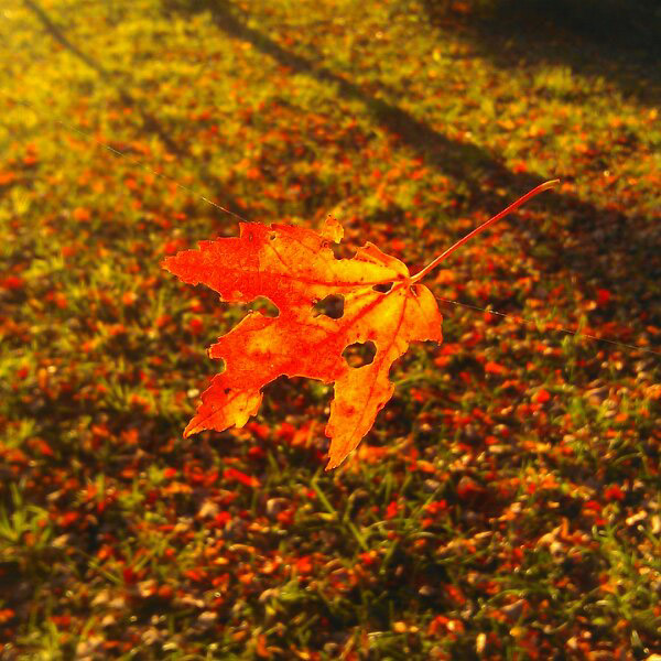
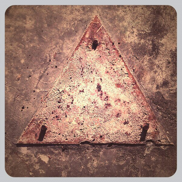
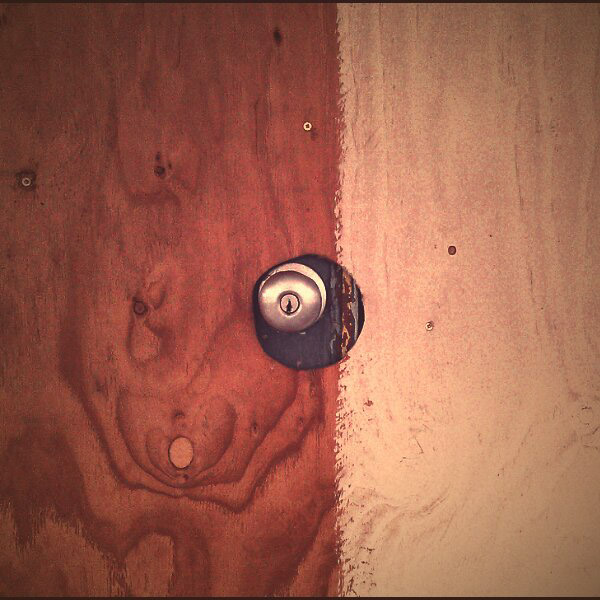
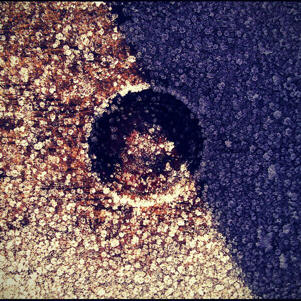
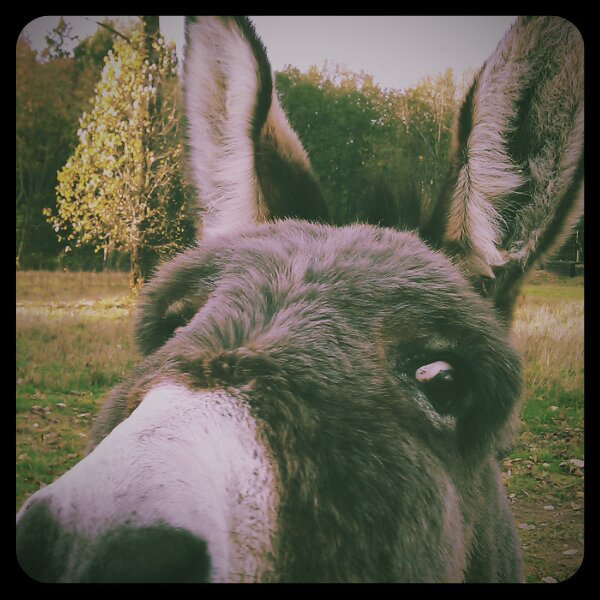
Pentax has included the ability to do multiple exposures with their DSLR’s and some other digital cameras all the way back to 2003’s *ist D. In fact my Z1p film camera from 1994 allows up to 9 multiple exposures but it really takes the Q to make it this much fun. The Pentax Q multiple exposure mode takes 4 button clicks to access through the menu but once you are there it brings you back to the same spot after you have made one so its easy to keep experimenting. With these images I’ve chosen to only do two exposures but up to 9 are possible. After you take the first image that picture remains on-screen while you take the next allowing you to see how they may come together and to make exposure adjustments.

The fun aspect with the Q seems to come from the fact that you use the rear LCD to compose images anyway and that it is so small you can just point it around like it’s part of your arm. Another thing may be that the entire raison d’être of the Q is to have fun and it allows you to let go of the serious side. It provides a similar aesthetic to the subgenre of film photography that uses plastic cameras and odd films. I’m sure that there are smart phone apps that function similarly but I find that phone cameras still leave a lot to be desired when it comes to making quick adjustments. As a final note the Pentax K-3 DSLR takes multiple exposure to an entirely new level: with up to 2000 exposures, interval timing, delayed start and 3 different modes of compositing. Pentax K-3 Multi Exposure
no comments | tags: exposure, Pentax | posted in Composition, Photography
May
25
2014

They really aren’t kidding with this film when they say handle in subdued light. I thought that for the most part I had been careful yet the film ended up being heavily light struck. All indications are that the light came in through where the film exits the canister so none of this would have been while the film was in the camera. What makes this film unique is that it doesn’t have the usual orange dye masking of nearly all other c41 colour negative films. This is supposed to make it easy to scan and more versatile in different lighting. Unfortunately for me the light leak over rides any other factor of this film. That being said even those images struck by light have a certain look that makes them unique and clearly sets them apart as being from film.

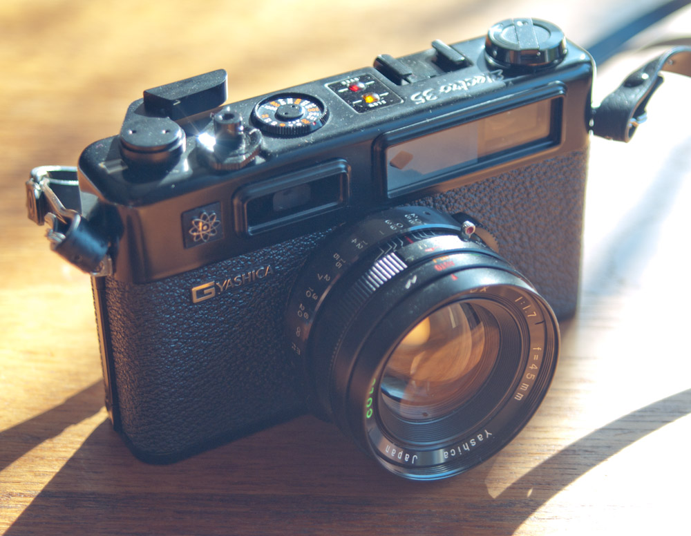
I shot this roll of film in my trusty Yashica Electro GT


no comments | tags: Cameras, film, Photography | posted in Cameras, Composition, Photography
May
15
2013
Everywhere you go downtown Calgary there is the Calgary Tower. It may not be the tallest building anymore but it sure ends up in a lot of pictures. I was in Calgary for a week and during my down time I walked around taking photographs. Here are 28 pictures I took in downtown Calgary that include the Tower so that you don’t have to.
If your from Alberta yes I am kidding I like Calgary there just were a few things that surprised me. Things like the downtown Tim Hortons being closed on Saturday and how the city center was so dominated by glass and concrete, but I will cover that in another post. Most of these images were taken with my new Pentax K-01 with a few from the Pentax Q, my film is out to the developers.
3 comments | tags: Calgary, Photography, Tower | posted in Composition, Photography
Apr
20
2013
Photography is a visual language that can communicate a range from emotions to simple facts, but photography isn’t quite as straightforward as it seems. Yes at its core is a representation of the reality in front of the camera, but what you frame and what you exclude determines how the image may be read. The key is ‘may be read’ because even more than words photographs are open to the interpretation of the viewer. This fact was highlighted for me recently while reading some commentary on the internet about a court case regarding the sale of an Eggleston print. Many people seemed unaware of Eggleston’s work and couldn’t imagine why anyone would want a print of a tricycle let alone pay large sums of money for it.
I think that some of the misunderstanding comes from a reading of the image from our moment in time and a failure to see it in the context of the time it was created. In this age of the cell phone image its hard to imagine the break from the past that was occurring when Eggleston and a few others embarked on an expansion of the photographic lexicon, bringing colour in.
Thank you Mr. Eggleston, there is some great further reading at the Eggleston Trust. And now for some of my own banality taking with my Pentax K-7
We may be numbed by the volume of imagery around, and this is even stronger for those of us that look at thousands of images on purpose, but it’s through the reading of many images that you develop a keen sense of the language. And it’s through understanding the language that you are better able to articulate your vision.
3 comments | posted in Art observations, Composition, Photography
Nov
30
2012
I was going to include this image with a pile of others but then I decided to pull it out and give it it’s own mention. Yes I’m that pleased with it. I really like the apparent interaction of the two individuals and the fact that the young man is smoking while the no smoking sign appears like a thought bubble from above the older mans head. Even the way they are sitting and leaning adds to the narrative.

1 comment | tags: Photography, Street | posted in Composition, Photography
Apr
8
2012
When you take a photograph, unless you arrive blind folded and close your eyes, you can’t help but be influenced by what you’ve seen before. That is the nature of photography, we try to recreate what we like whether it’s preserving an instant for the future or duplicating the now. I can say this because I do it too.
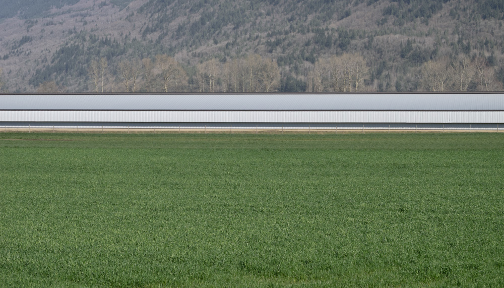
Case in point this image, I took this picture while out on a bike ride with my daughter. The moment I saw this long building I knew the way it ran horizontally would mimic the look of the Rhine river in Andreas Gursky’s “Rhine II“ Do I wish that I could say I just saw this building and took an interesting picture, yes, but to deny that in a sense this is an attempt to capture my own piece of someone else’s vision would be wrong.

So in a world so full of imagery how do you create a personal style and is that absolutely necessary. Is there anything wrong with being a “collector” of images or refining a type of image? I don’t think so if it serves the purpose of the photographer. Knowing that you’ve created something good and then wanting to share it is rewarding. An image like “Rhine II” isn’t valued at millions of dollars because it is such a good photograph but because of everything else surrounding the world of contemporary art.
So take another picture of blossoms or a bird or whatever interests you and enjoy the doing, and the knowledge that it’s yours.
no comments | tags: Digital, Photography | posted in Composition, Photography
Mar
30
2012
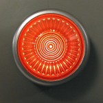
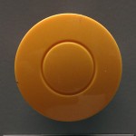
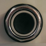
Well pictures of buttons taken with a cell phone anyway.
no comments | tags: buttons, cell phone | posted in Composition, Photography
Jan
24
2012
It becomes a bit more difficult to find subject matter during that time of year when everything is brown and drab. But rather than giving up or fruitlessly looking for what isn’t there I think you should embrace the winterlude and look to new subjects. Your images may not be as pretty but they could be as good. Where in the spring you might take a grand sweeping landscape shot now maybe you notice that one last leaf hanging on, or maybe you can take a moment longer on a composition. Some subjects such as industrial and city shots might better suit the winter or evoke a different feeling that you could not get on a bright spring day. In fact the extra challenge of finding subjects can help to make you a better photographer. I’m looking forward to taking some photographs in the snow but I’m not waiting for it. Of course this isn’t the same across the globe and I feel fortunate to have distinct seasons even if it can be cold sometimes.
UPDATE : Sometimes I write something and it gets pushed back for some reason and that’s the case here. Since I wrote this post it has most definitely snowed and is now melting.
no comments | tags: film, Photography, winter, Yashica | posted in Composition, Photography
Jan
11
2012
Not every image can and should be composed by “rules” but awareness of the underlying reasons can aid in understanding how to use them to create images that say what you intended. When composing within a square format things are slightly different than the more familiar rectangle. The image edge is even more important and in reality is part of the overall picture. What I mean by this is that the placement of the focal point is more strongly felt in a square image than a rectangle as the distance between the focal point and any one edge is easily visualized. So the balance of an image within the frame is more quickly discernible by the viewer even if only subconsciously.

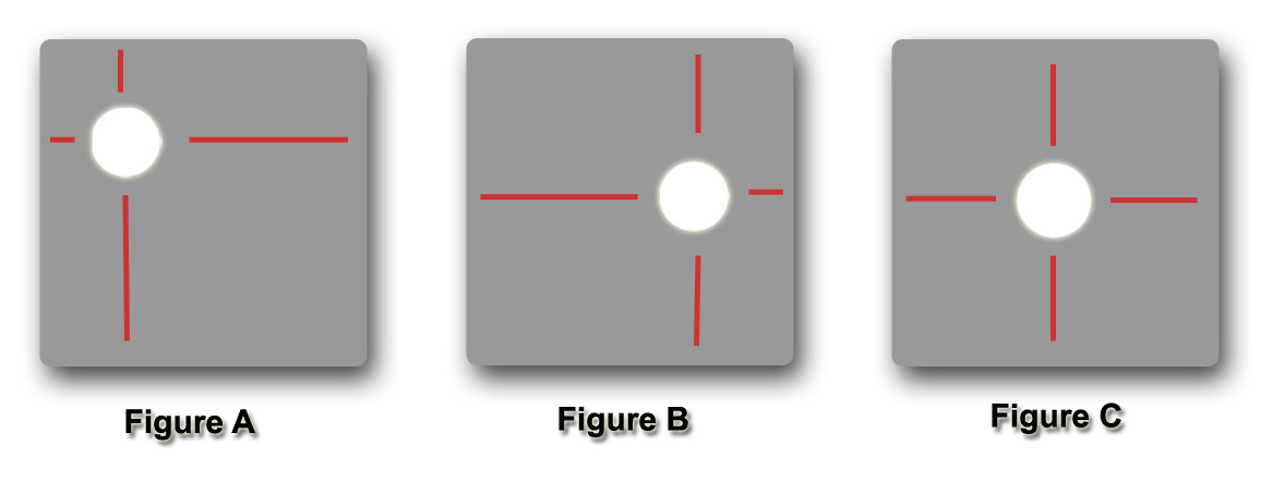
Looking at figure A it is clear that the circle, which for this illustration represents our focal point, is in a dynamic position with greater tension between the left and top edge verses the bottom and right edge.
Figure B is also unbalanced but to a lesser degree as the tension is primarily between the left and right edge of the frame.
In the final illustration Figure C you can see that the image is balanced and the competing tensions are neutralized.
When composing for rectangles we often try to avoid placing the focal point at the center of the image. With rectangles there never is truly complete balance as there is always a difference between the distances from top to bottom or left to right. The result of this is usually a very static and boring image.
Here are four examples of images shot with my cell phone that illustrate the point of balance between the subject and the frame.


You can also see that in the latter two images I have divided the image plane separately from the focal point adding to the interest of the images while keeping the focal point balanced.
More often than not this will still not produce the most dynamic composition but thinking about the picture edge and it’s effect on the image will help you create better compositions.
Don’t be afraid to break out of the box

2 comments | tags: composition, Square | posted in Composition, Photography
Jan
10
2012
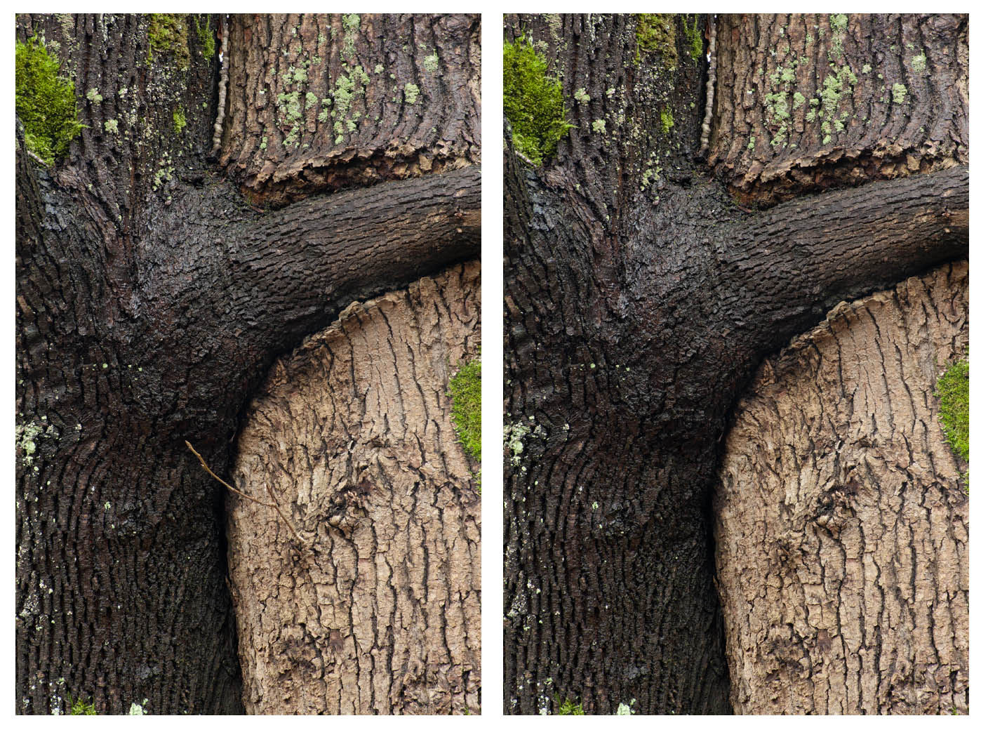
I wanted to show a simple example of how powerful a point of high contrast can be in a composition. Despite the small size of the light coloured branch it’s contrast against the darker tree pulls the eye to it. In this case it is not the intended center of interest and it therefore detracts from the image. While it is no longer strictly a photograph but also a manipulated image it is a better and simpler composition. So would we say the same thing if I had done the pruning then and there as opposed to digitally? That I will leave to you to decide.

no comments | tags: composition, Photography | posted in Composition, Photography
