Harmony, tone and hue.
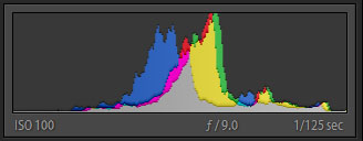
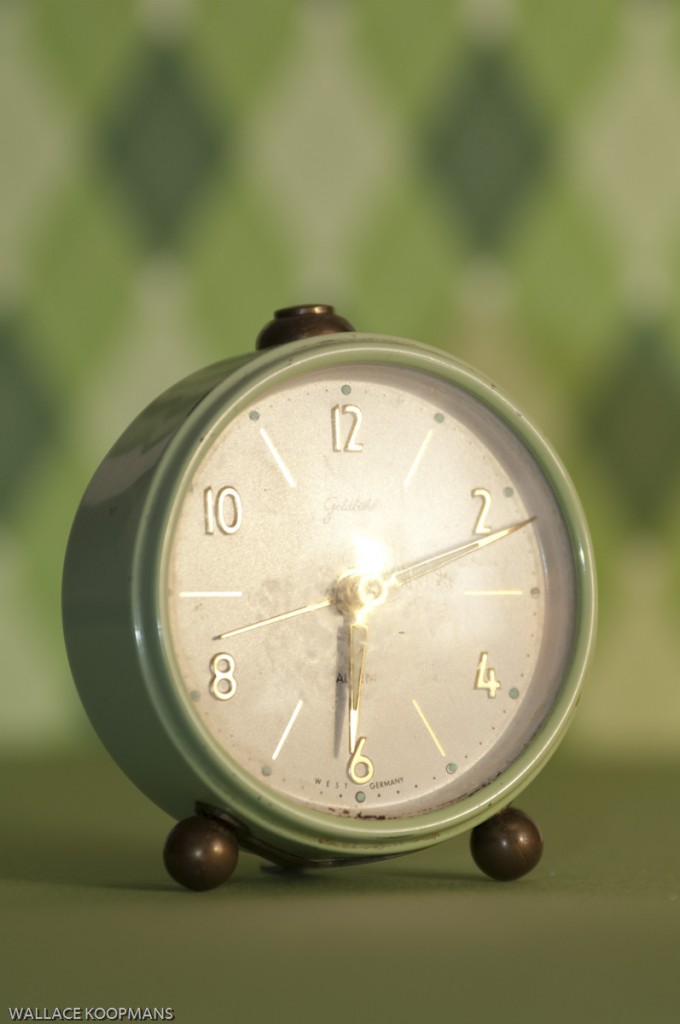
Colours that are analogous, such as those that lie next to each other on a colour wheel, or are generally neutral can be made more harmonious through tone. What is tone? If you think of the colours in an image in terms of black and white the value of that color or how dark or light it is, is it’s tonal value. You can see this in the histogram for this image, all the colours fall within the middle range or middle key. There is a danger that an image may be static or flat when all the values are so similar and when painting one would likely add something to offset this. However, the intent of this image is to evoke the feeling of a bright warm morning and the harmony of the tones and colours helps produce this.

The setup
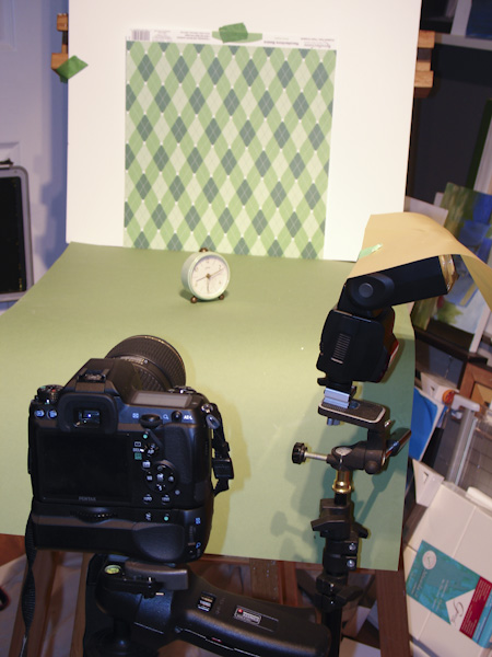
Creating this image was done by placing the clock on a piece of foam-core. This was in front of a piece of paper which was used to mimic wallpaper and was selected to compliment the clock. A single flash with a gold translucent material was aimed at another piece of foam-core which would then give an illusion of a window in the reflection of the face of the clock. A word of advice, check the time on a clock if your trying to represent a particular time. Initially I must have been in the high arctic because I had morning light at 2:42 AM. So this one is afternoon light, problem solved.

Another variation

