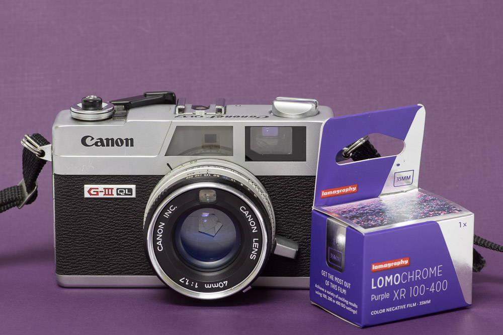
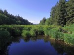
Lomochrome Purple with the Canon Ql17
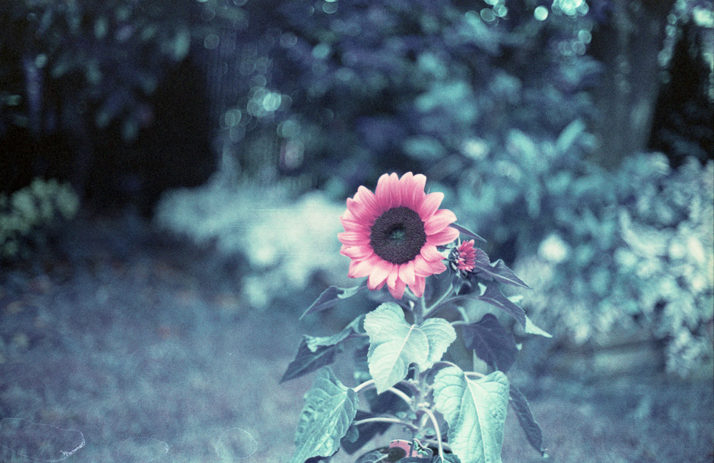
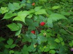
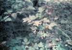
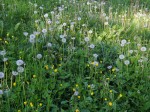
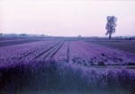
I have mixed feelings about Lomochrome Purple which matches the mixed results I’ve gotten. Perhaps my expectations of achieving a look along the lines of an infrared film are at fault but it’s also the fact that it doesn’t appear to shift in colour in quite the way Lomography suggests. You can see from the chart I did to go with my first post how the colours shift Lomochrome Purple. I like how deep blues turn cyan and yellows turn a pink but I’m frustrated by the lack of shift I have achieved with green the one colour I had the highest hope for. I will have to rethink the way I use this film if I do again. Choosing things that people know to be a certain colour are the most effective, something that could be green or purple isn’t going to have the same impact as say seeing a pink line down the middle of a road or a sunflower that looks like a shade of alizarin crimson.
On one side is a digital image from the same scene as the Lomochrome Purple version opposite.
